Finding Prudence and Simplicity
Here’s a project wherein both the macro and micro aspects of the building architecture contributed to the overall signage experience.

Here’s a project wherein both the macro and micro aspects of the building architecture contributed to the overall signage experience.
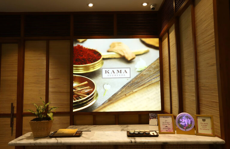
The floating-island positioning and the façade curvature of the Kama Ayurveda store at Worldmark, Aerocity, New Delhi made VDIS engineer many firsts for the brand from a signage & graphics standpoint.
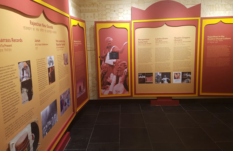
For those looking to design museums and galleries in India, this one’s a lesson on how to make such spaces interactive and alive! RRAP was an extremely fulfilling project
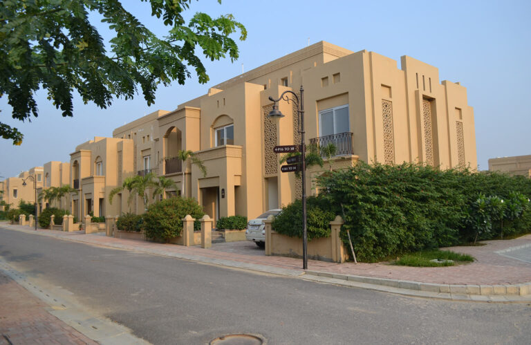
It won’t be an exaggeration to call this one a 72-acre oasis on the north-western edge of Lucknow.
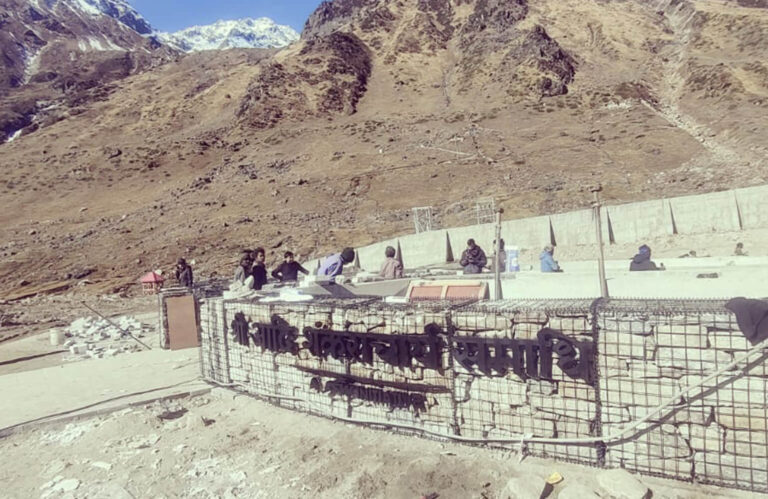
When we were asked to design and build the sign identity for the recently inaugurated, Shri Adi Shankaracharya Samadhi Sthal at Kedarnath
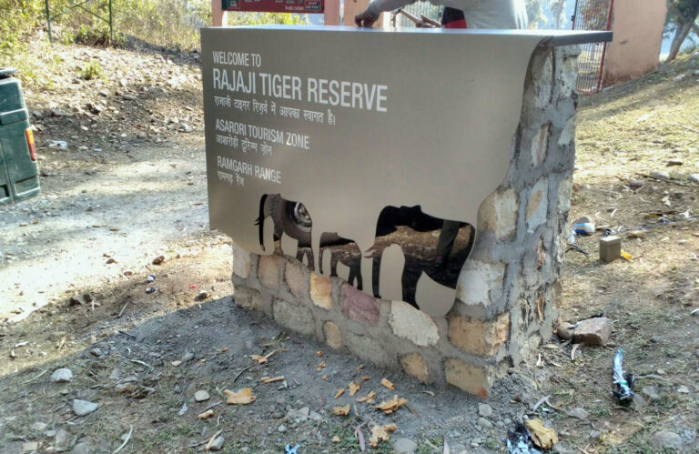
Rajaji National Park near Dehradun is less frequented by the human species compared to the heavy footfall in its larger cousin, Corbett Tiger Reserve.
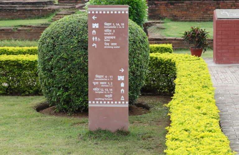
For the first part, we chose red sandstone as the base for all the signage elements.
Red sandstone gave us a colour that married well with the redbrick architecture of the
complex

Keeping it clean and simple was the only brief we got from this, quintessentially British brand; and clean and simple has been our engineering mantra ever since we started producing and implementing M&S signage assets across the country, eight years ago!
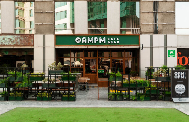
The signage of AMPM Cafe & Bar at Gurgaon, is a coming together of the modern and classic palettes. The classy forest green base with copper framework houses the modern-day iconography with chunky acrylic box-type letters illuminated using LED modules.

For an organisation that anchors the change in the fabric of technology innovation in India, the experiential graphics at its corporate office in Noida needed to be colourful, vibrant and full of impact.