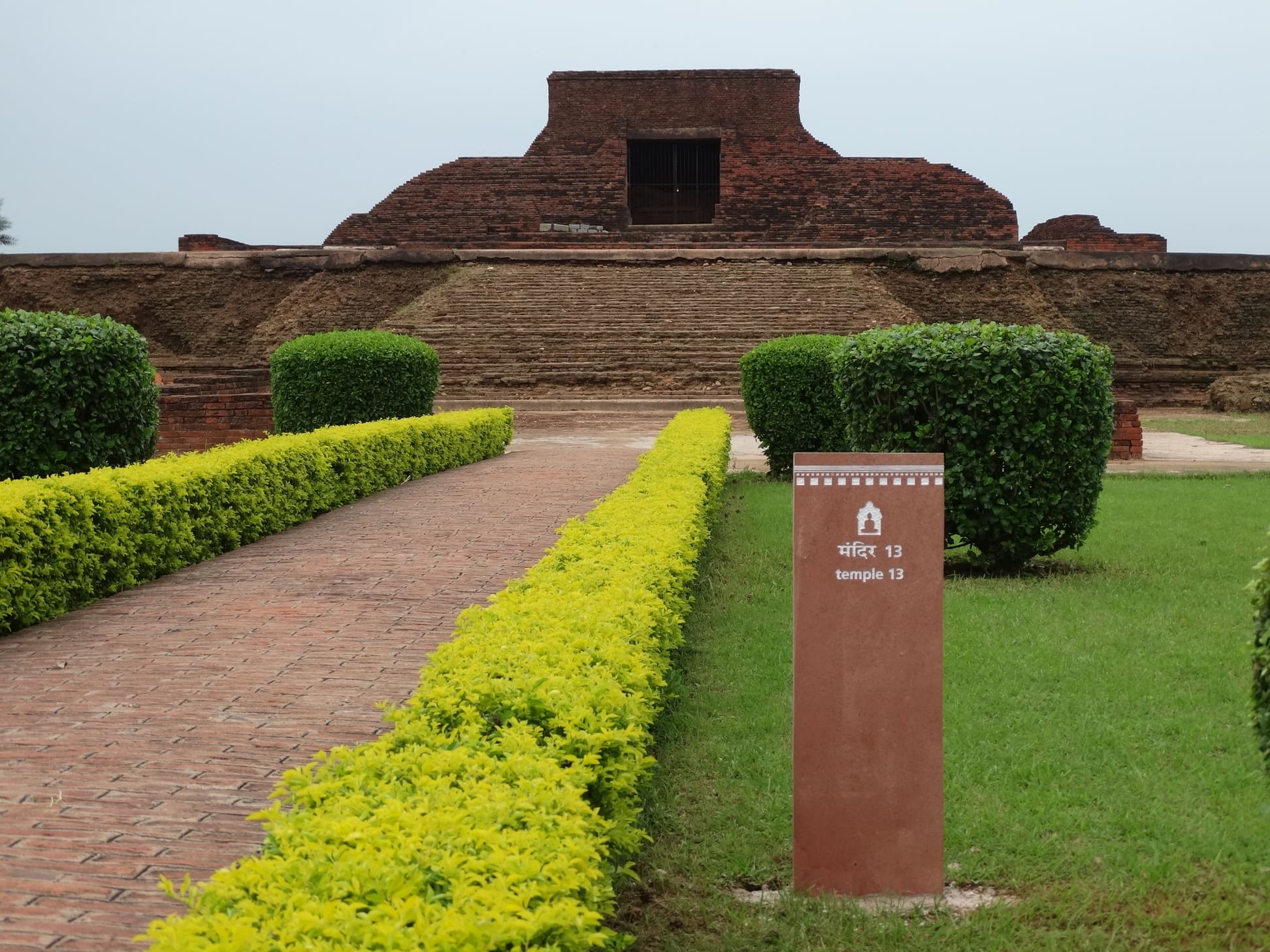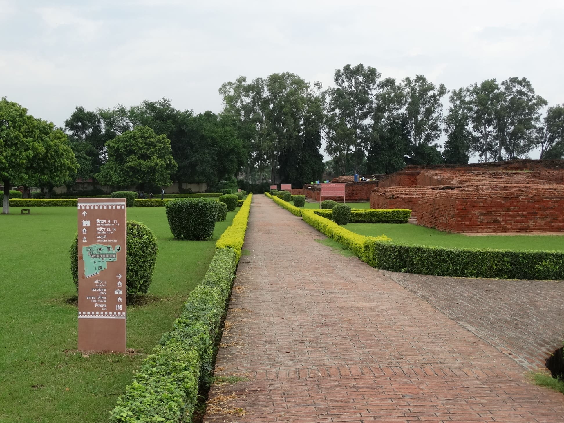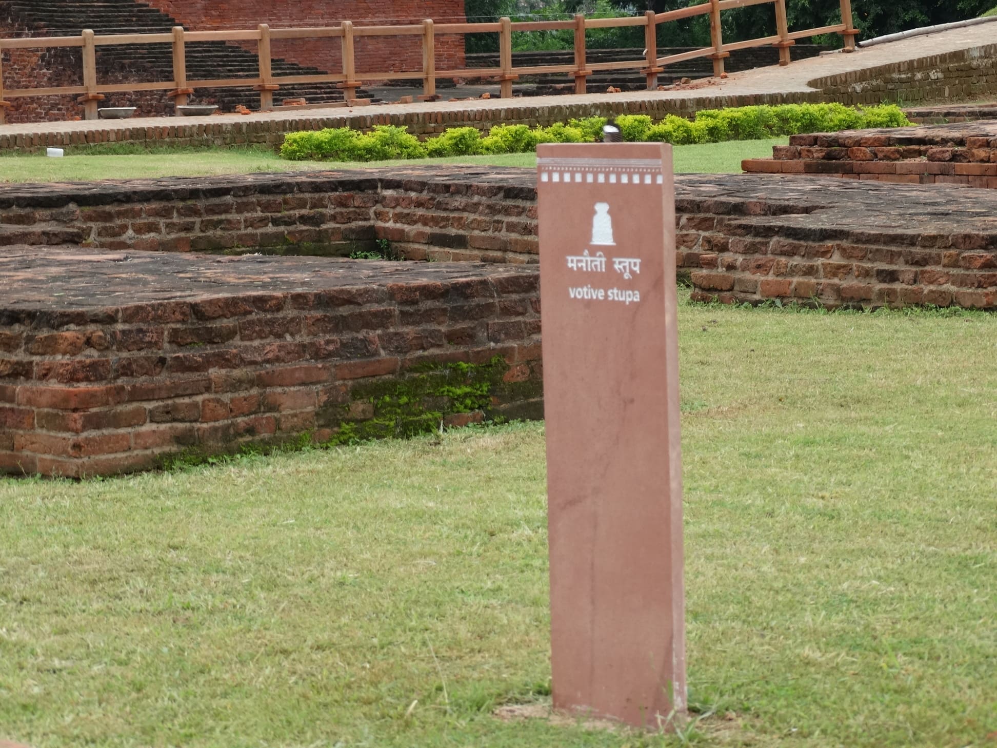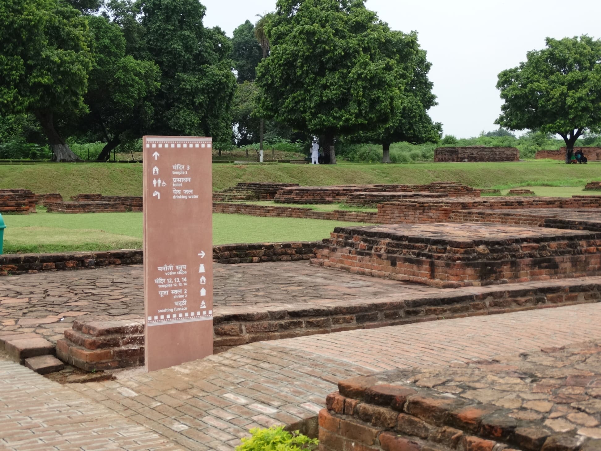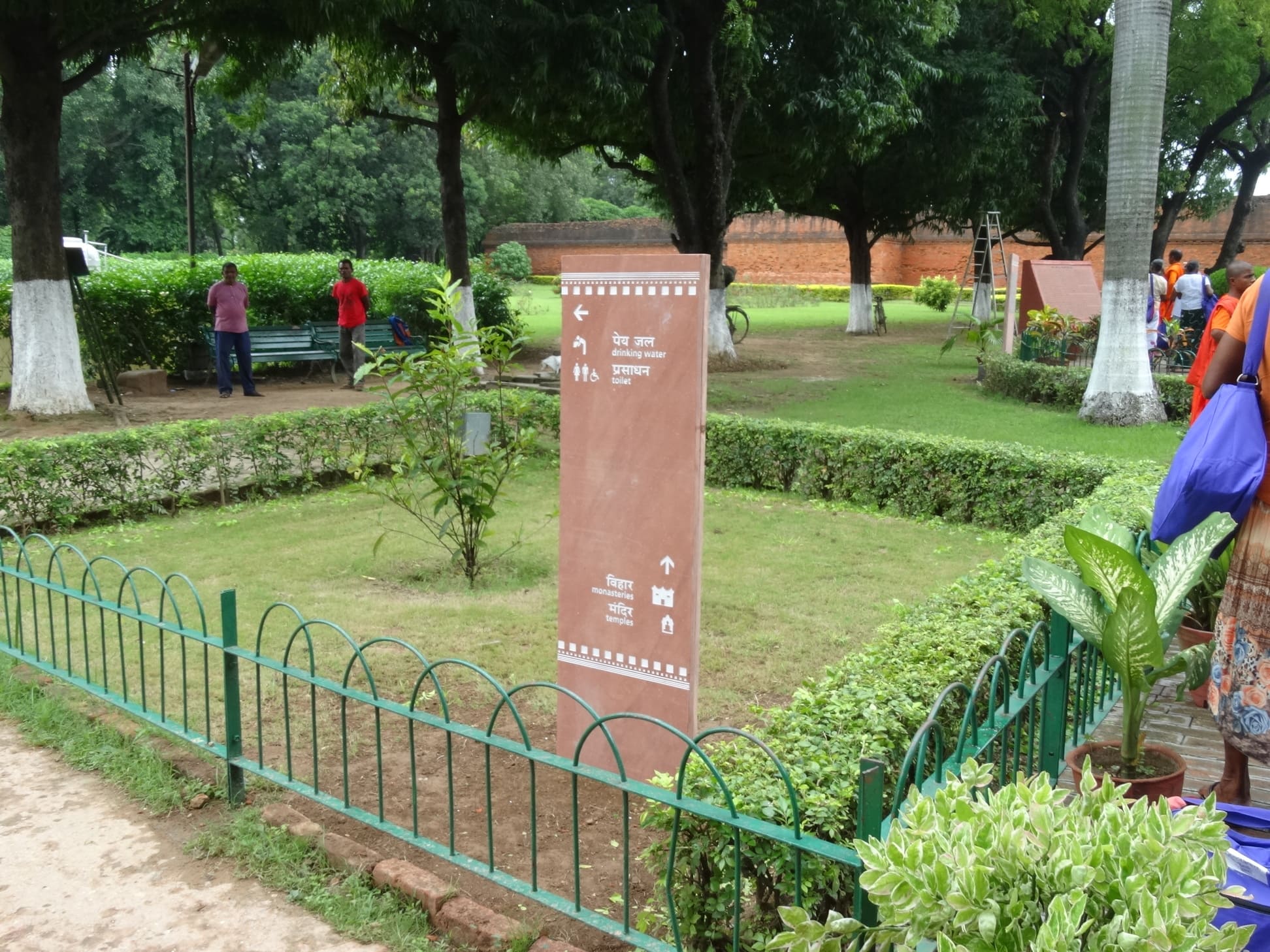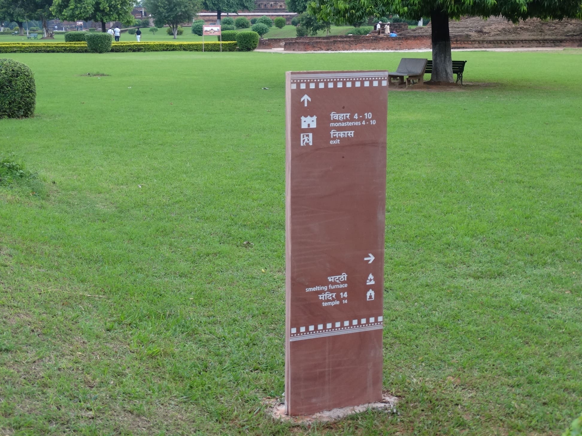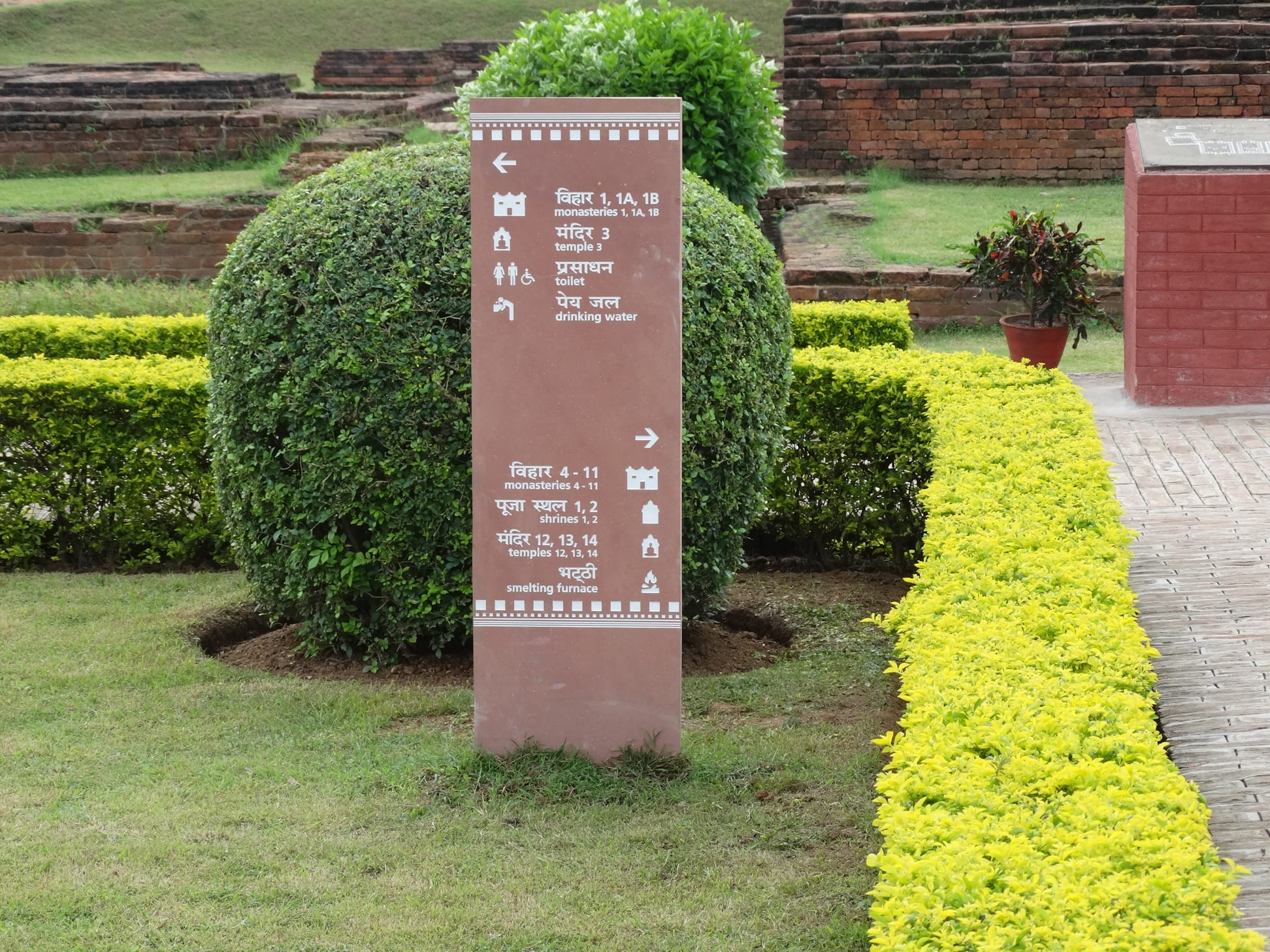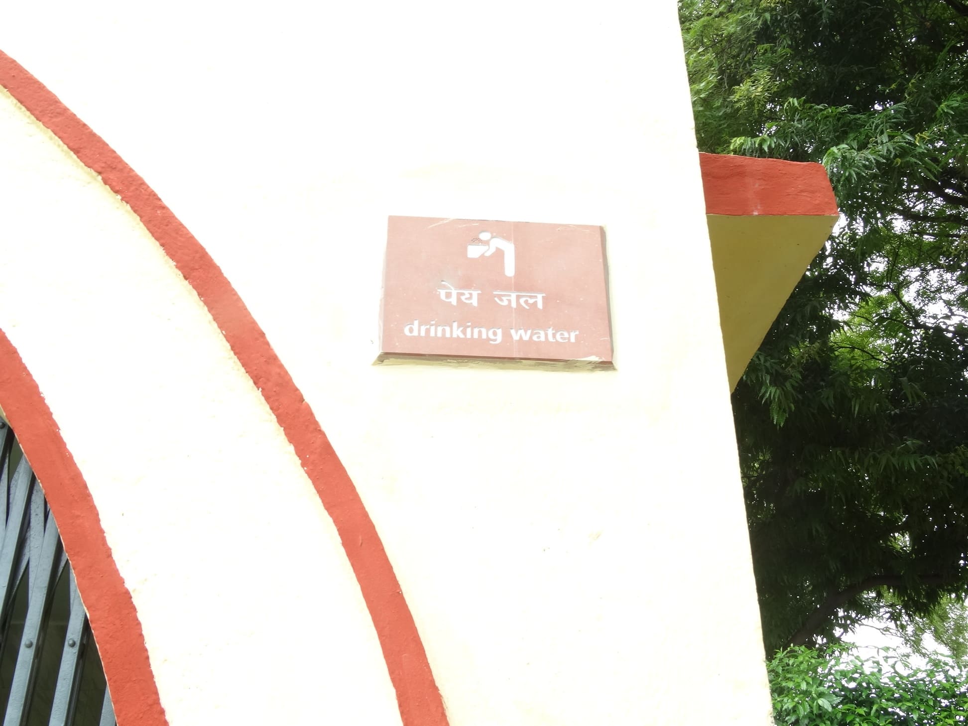
For the first part, we chose red sandstone as the base for all the signage elements. Red sandstone gave us a colour that married well with the redbrick architecture of the complex, and yet its smoother texture and finish made it a distinguishable aspect of the entire architecture. We identified structural elements common to the university’s architecture and created a motif that became part of the signage identity and worked as a designing framework for the content given in the signage. The iconography was created keeping in mind, the histories and purposes of the structures and monuments, creating an interpretative point of appreciation for the visitor. The use of maps in the way-finding signage also worked as a means to guide movement for visitors. Each map worked as a cue for the visitors to walk to the other sign and conveniently explore the entire complex. A few months after our intervention, the ancient Nalanda university ruins were declared a UNESCO World Heritage Site. We feel proud that our two pennies’ worth intervention had a role to play in this achievement.
Typology
Public Spaces
Location
Nalanda
Designer
VDIS
Client
Archaeological Survey of India
