
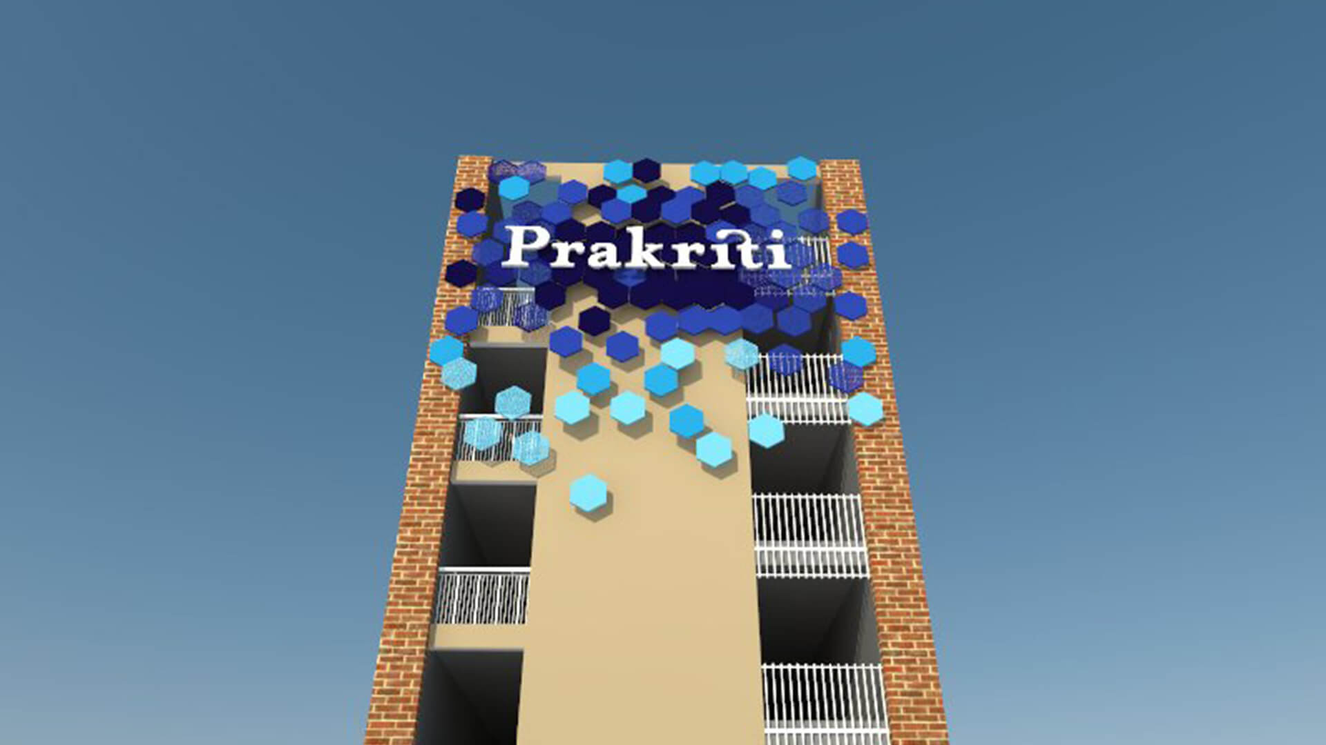
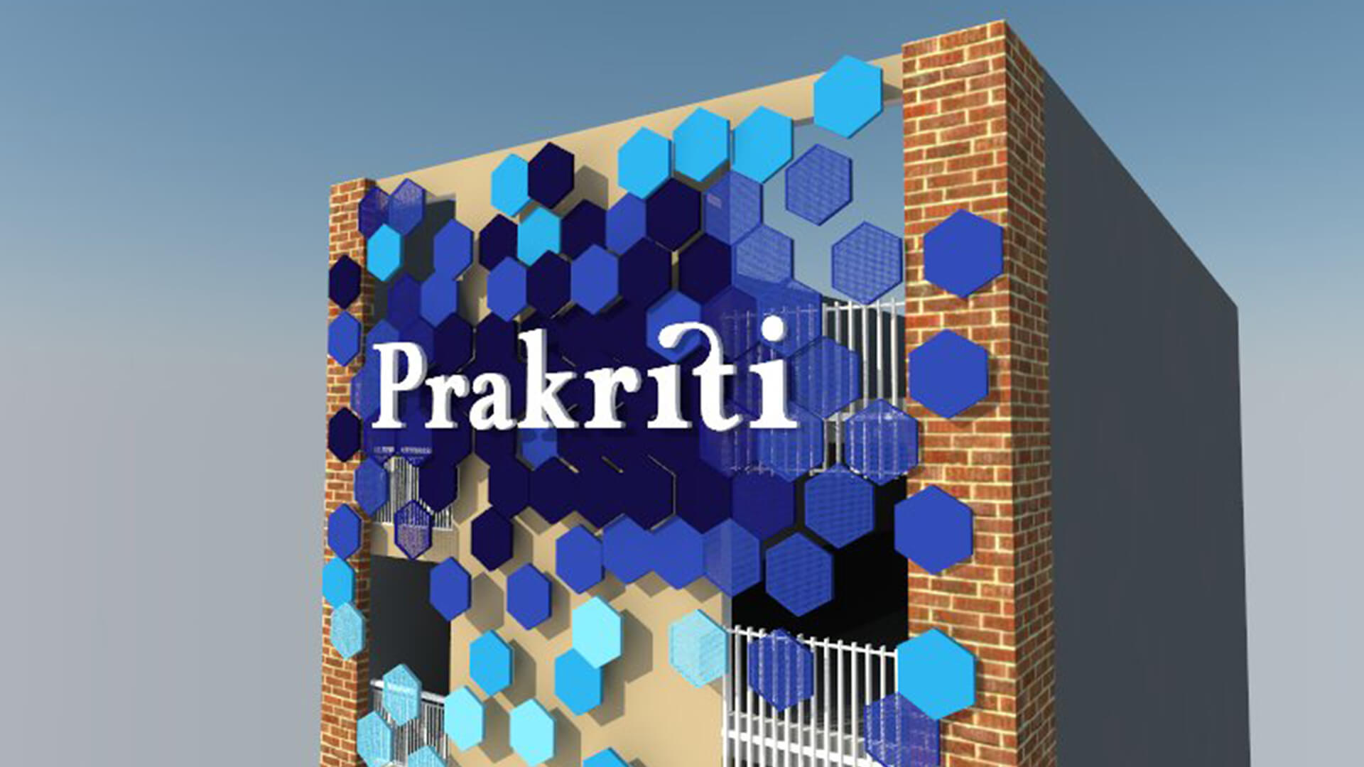

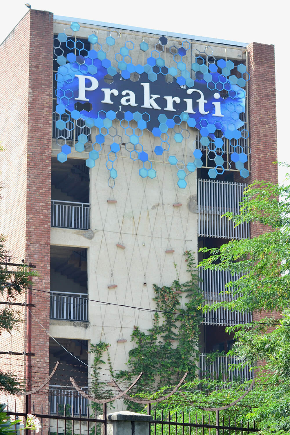
This design of ours is a classic example of a sign identity imbued with both brand and architectural elements. The hexagonal facade, which is inspired by the architecture, spreads uninhibitedly, much like the blue ink blot that is intrinsic to Prakriti school’s brand and cultural philosophy. The creeper’s catching up, and will soon fill the backdrop. We look forward to that!
Typology
Institutional
Location
Noida
Client
Prakriti School
Principal Architect
Urbanscape Architects
Built up Area
2 Acres